Sick of skateboarding kids and milk carton cows? Tetra Pak exec urges smarter design decisions
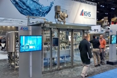
A typical packaging design development project takes 18 months, Muratoglu (photographed below) who is VP of marketing and product management, USA & Canada, explained to BeverageDaily.com at Pack Expo in Chicago this month.
“Of that 18 months you spend 12+ months of it on packaging type selection, equipment selections and capital investment. During this time most of the senior management of both organizations are engaged,” he said.
“Once these decisions are made, the rest of the project tends to go to more junior levels of the organisation, and most of the design decisions are made there. Unfortunately, what the retail customer/consumer are going to see is not as integrated into the entire process,” Muratoglu added.
“The impact is major. Walk down the typical US retail aisle, look at the images you have, though there are exceptions. But take kids’ beverages – you have standardized graphics. If say, it’s for 10-year olds, you have to have a boy with a skateboard.”
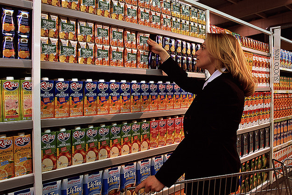
Orange juice in orange cartons is ubiquitous
“And if you have milk, you have to have a cow on the package. It goes on that way. So we need to find ways to create the appropriate messaging and differentiation,” Muratoglu said.
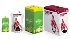
Color conditioning among brands is also rife, he added, singling out the orange juice aisle where that color is ubiquitous. He said Tetra Pak worked with a customer on a red carton for Valencia Blood Orange juice from Spain to lend differentiation, with the opacity of cartons vs. PET an added benefit.
“Why not choose red? You immediately scream from the shelf that you’re different,” he said.
Increasingly, Muratoglu said packaging designers also had to consider the ubiquity of smart phones with small screens that might prompt the initial purchase.
Packaging and the ‘first moment of truth’
Whereas the ‘first moment of truth’ or interaction with the product use to be on grocery store shelves, he said, increasingly it is on a smart phone. And not only the shopping decision, ‘experience decisions’ also occur online, as our social media contacts say what they think of products.
“With milk you could have a carton design that is entirely infographic. Think of the impact on the younger generation!" (Suley Muratoglu, VP of marketing and product management, Tetra Pak USA & Canada)
“It’s a very different dynamic, trying to find ways to integrate your design to communicate in these different mediums. I’m not suggesting I have the solution. But this phase of graphic design implementation is so critical, not enough time is devoted to it during the product phases,” he said.
“We [as an industry] do consumer research to the ‘Nth’ degree on the concept – but in terms of how the graphic design really relates to that product concept, how it actually works on the actual shelf – there’s very little of that done in practise,” Muratoglu said.

The rise of infographics and image-led consumers
He said Tetra Pak addresses this lack through an internal design group and workshops for customers, which includes work to apply consumer trends to the pack design of more traditional products.
For instance, Muratoglu said research showed that younger consumers are more visually driven and less attentive to text, as the rise of infographics in the mass media shows.
“Why not bring this connection to packaging – use the language of infographics to get your key brand and product messages across?” Muratoglu said. “You can even connect this to traceability, food safety, where your food is coming from.”
“With milk you could have a carton design that is entirely infographic. Think of the impact on the younger generation! You’re directly communicating with them in a language that actually connects, but also conveys messages that they’d never read on the back of your package,” he added.
“You boost sales and shelf presence but also communicate your values to a consumer base that really connects with them,” Muratoglu said.